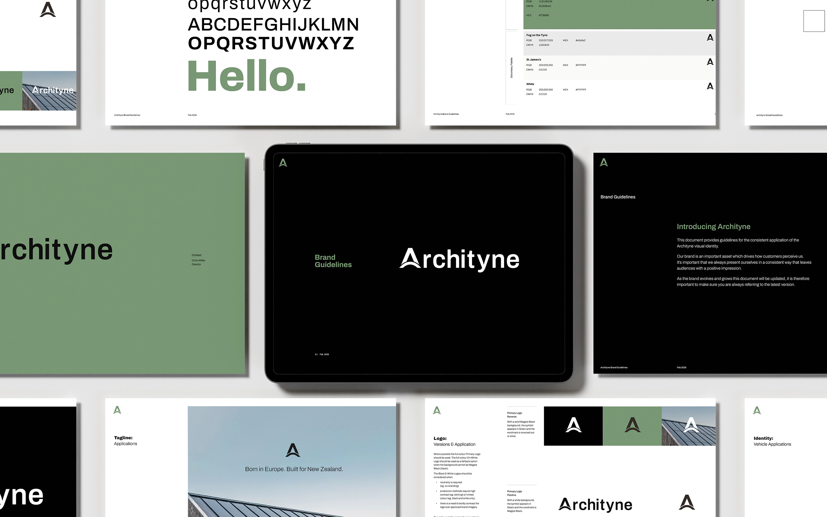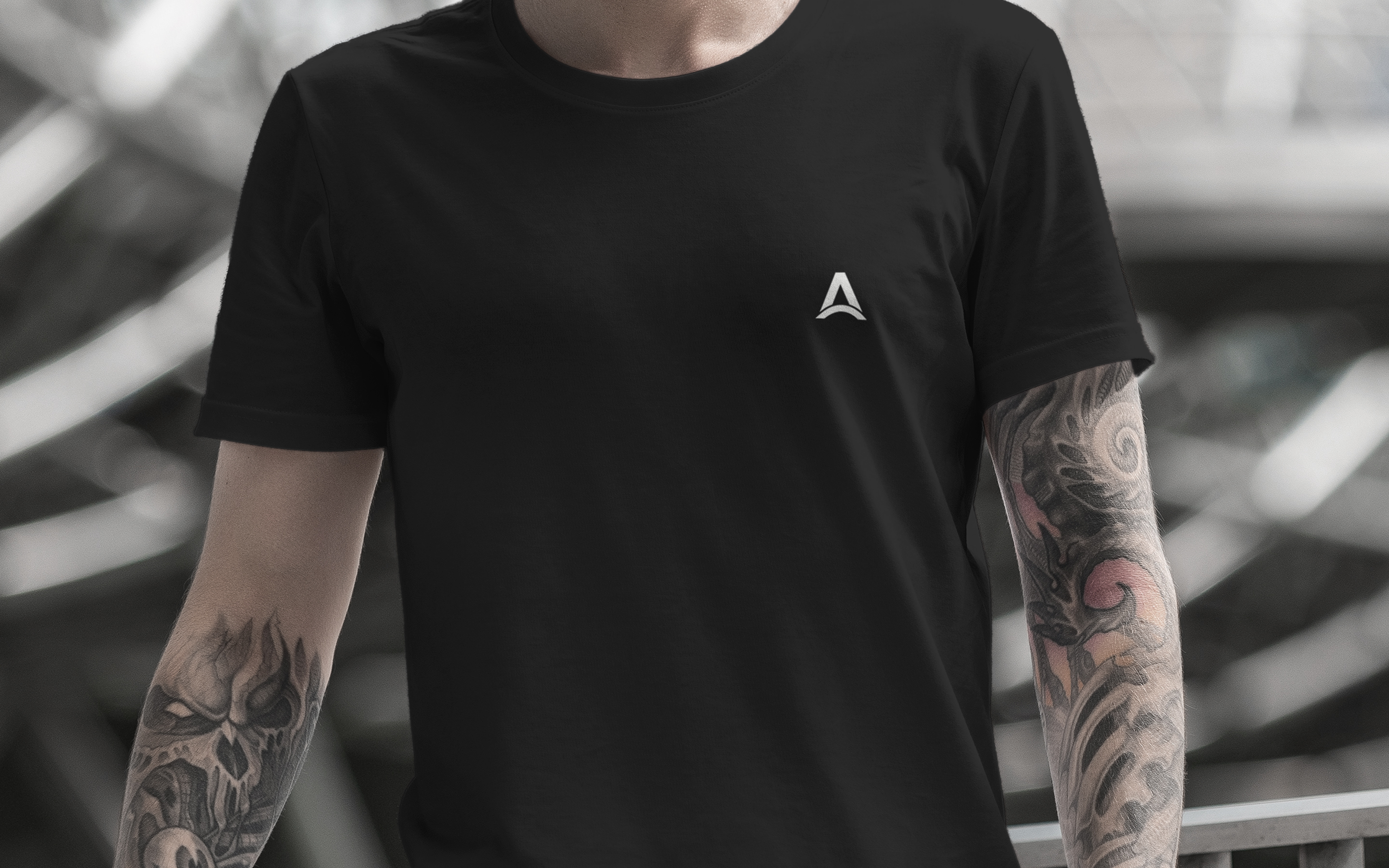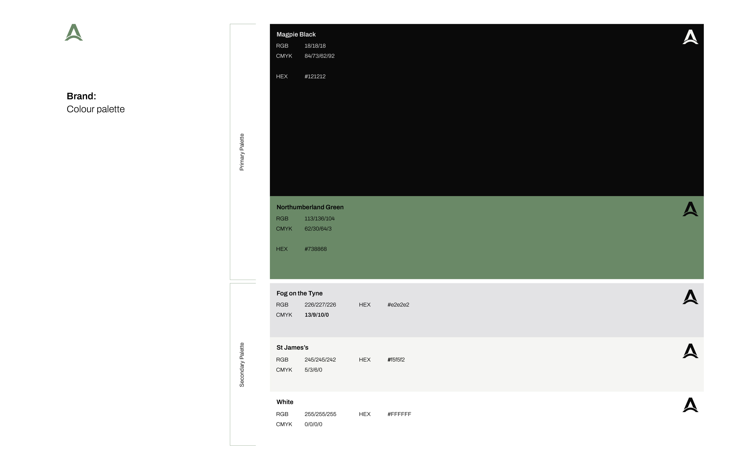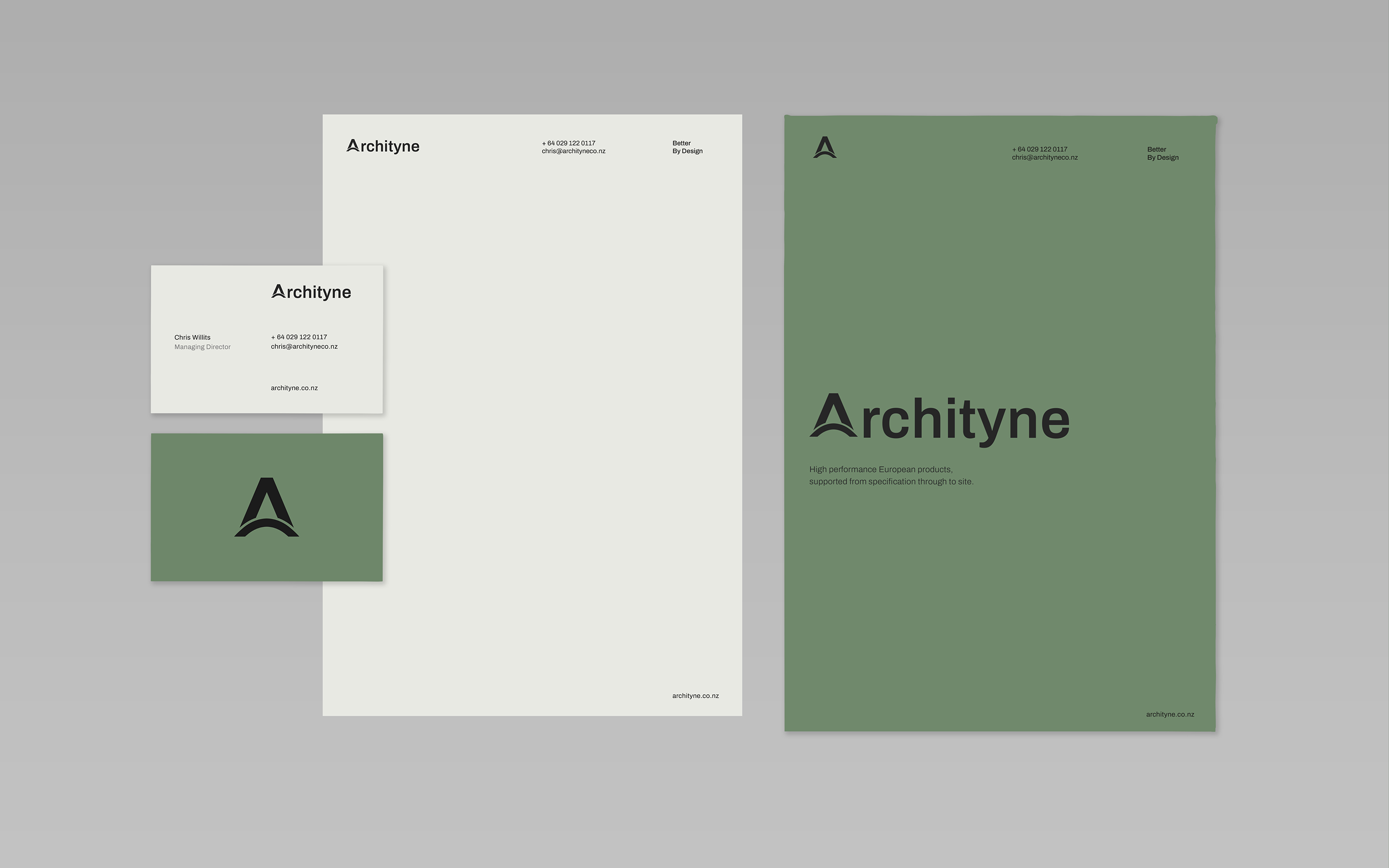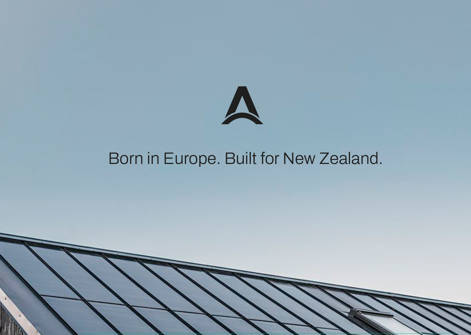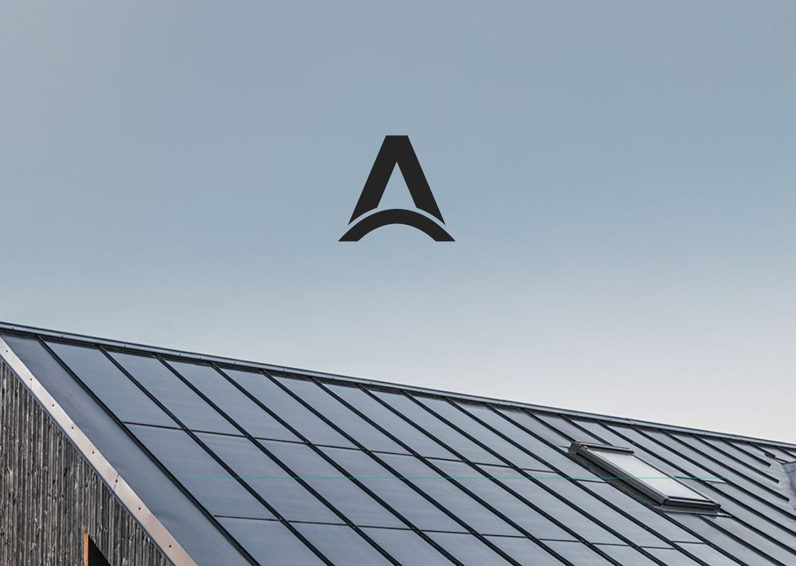
Archityne connects European building product manufacturers with projects in New Zealand. The concept centred on connection, inspired by the arch of the Tyne Bridge in Newcastle — a subtle reference to the founder’s UK roots. Using the bridge’s proportions, we created a bespoke “A” icon with a modern, premium architectural feel.
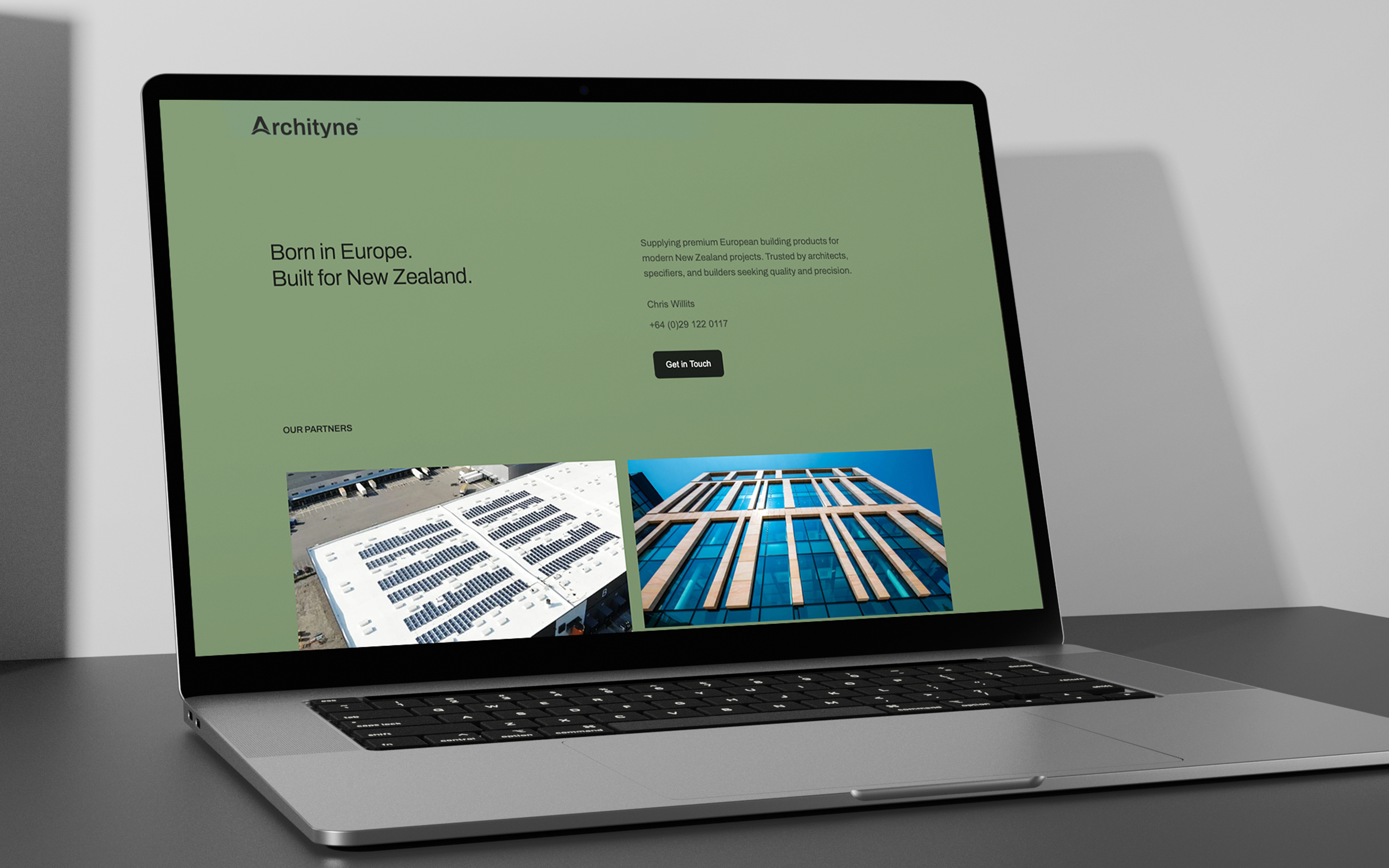
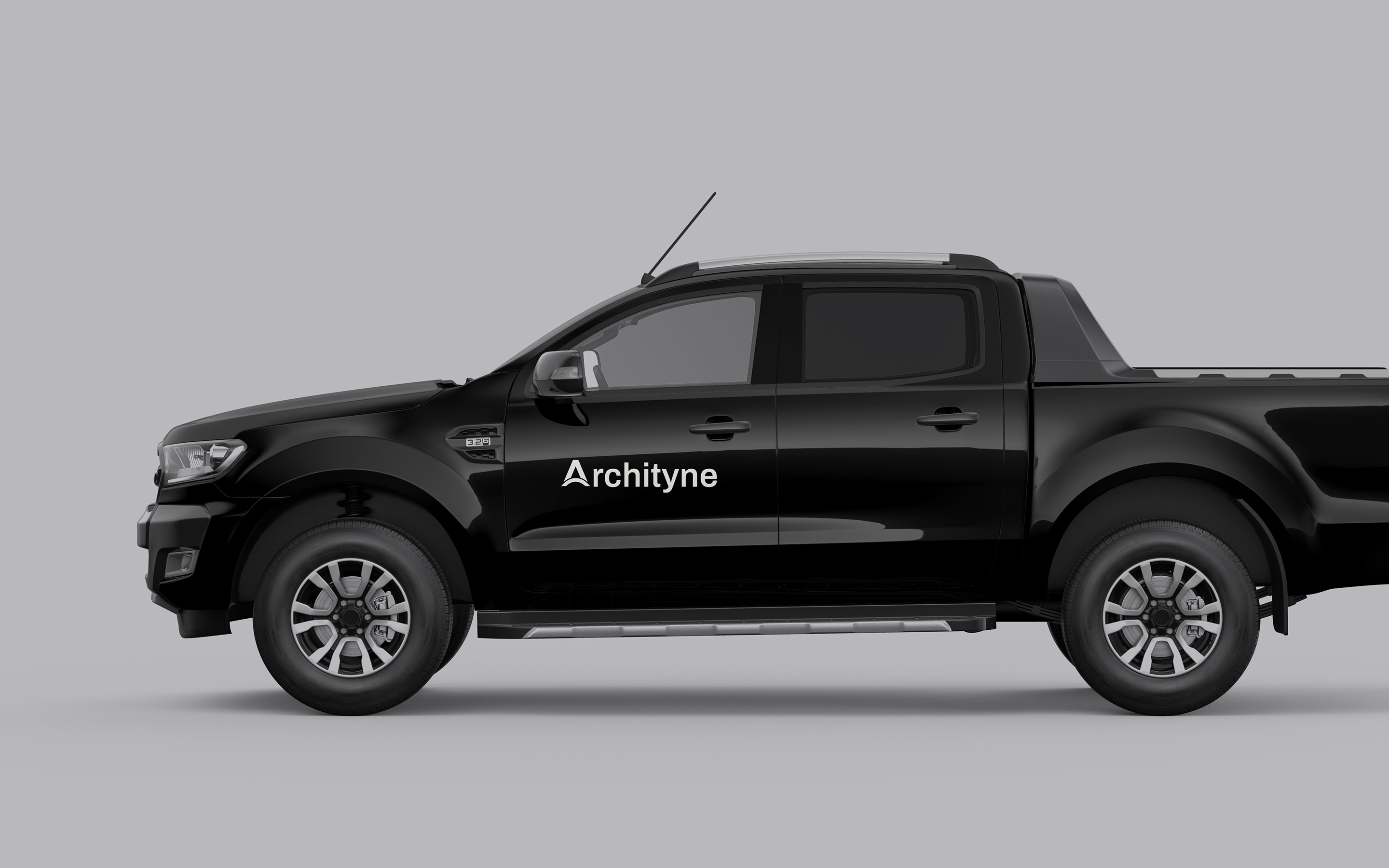
Paired with a clean contemporary typeface, the mark symbolises Archityne’s role as a link between manufacturers and projects, and between design and delivery. The rebrand extended across brand materials, presentations, and digital assets, creating a clear, confident identity that works across all touchpoints.